A rebrand is one of the riskiest things a brand can do. Get it right and you breathe new life into something people already trust. Get it wrong and you spend years winning back the customers you had. So we asked two of our designers, Lead Designer Tayler Nuttall and Creative Designer Alex Vann, to pick the rebrands they rate most and tell us what makes them work.
Four very different brands came up. A bread maker, a museum, a software giant and a cheeky cereal start-up. But the same lessons kept surfacing. Have a read and see if you agree with their choices.
Warburtons: Baking heritage into a modern rebrand
For Tayler, pushing an iconic brand forward takes real skill. “It needs to be really considered and not done on a whim,” she says. Taxi Studio’s rebrand of Warburtons is exactly that.
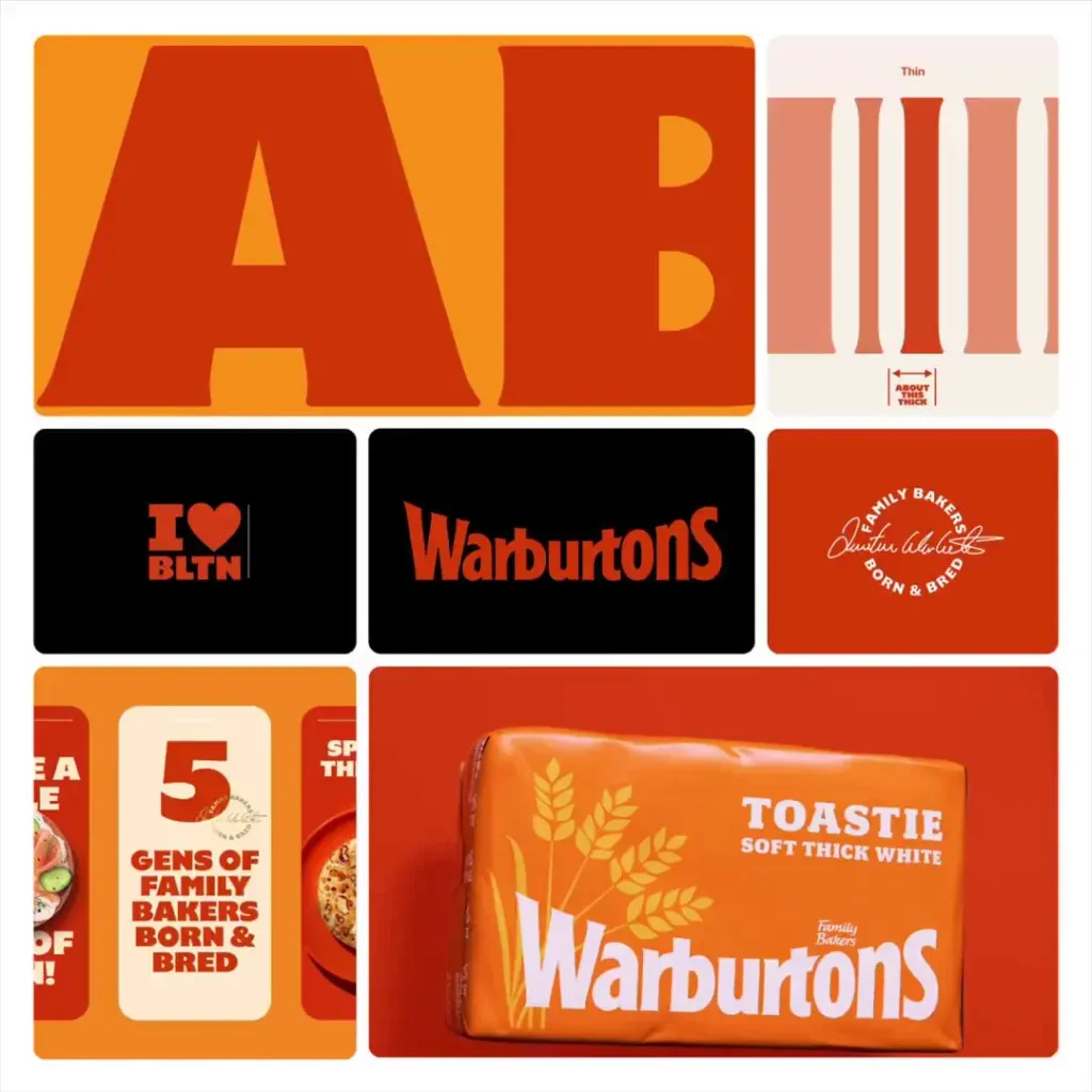
The standout is consistency. The new system works across a range of 70 products in all shapes and sizes, and every one of them feels part of the same family. The brand looks fresh without throwing away its heritage. A new stamp nods to the company’s history and sits on pack like a family seal of approval.
The team also made smart use of what Warburtons already had. The curve of the old logo lettering, the Warburtons “smile”, has become a bold, recognisable device used across the range. The logotype is bigger and easier to spot. Wider bars of colour help shoppers tell products apart on a busy shelf, and clearer typography makes everything easier to read from a distance.
Then there’s the orange. “This is such a clever move only a brand with years of recognition could pull off,” says Tayler. The Warburtons lorries have been driving the colour up and down the country for years. Making it the primary colour on pack simply takes ownership of recognition the brand had already earned. It’s the same trick Coca-Cola pulled off with red.
The result is packaging that makes choosing quick and easy for shoppers of every age. Sometimes less really is more.
Natural History Museum: Simple doesn’t mean basic
Pentagram and Nomad’s work for the Natural History Museum is another of Tayler’s favourites, partly because of the subject. “I’ve grown up with iconic figures such as David Attenborough and Steve Irwin teaching us about all the wonders of the planet,” she says, “and this rebrand really embraces that feeling.”
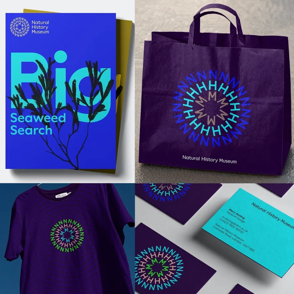
The logo doubles as a brand device, built from the letters N, H and M, and it’s animated. It’s a perfect example of simple done well: pleasing to the eye and full of impact.
What impresses Tayler most is how the agencies future-proofed it. They built a tool that lets any designer recreate the animation in the same style. Change the words and colours and the tool generates the circular animation for you. That’s consistency baked into the system, not left to chance.
The vibrant colour palette sings against darker backgrounds, and showing each colour alongside images of the natural world proves it works across every part of the museum. Bold typography grabs attention without making you work to understand it, while cut-out imagery adds a sense of fun and curiosity.
It’s also a great example of collaboration. Two agencies focused on their strengths and shared what they knew, and the output is a brand built to stand the test of time.
Adobe: One brand. One studio
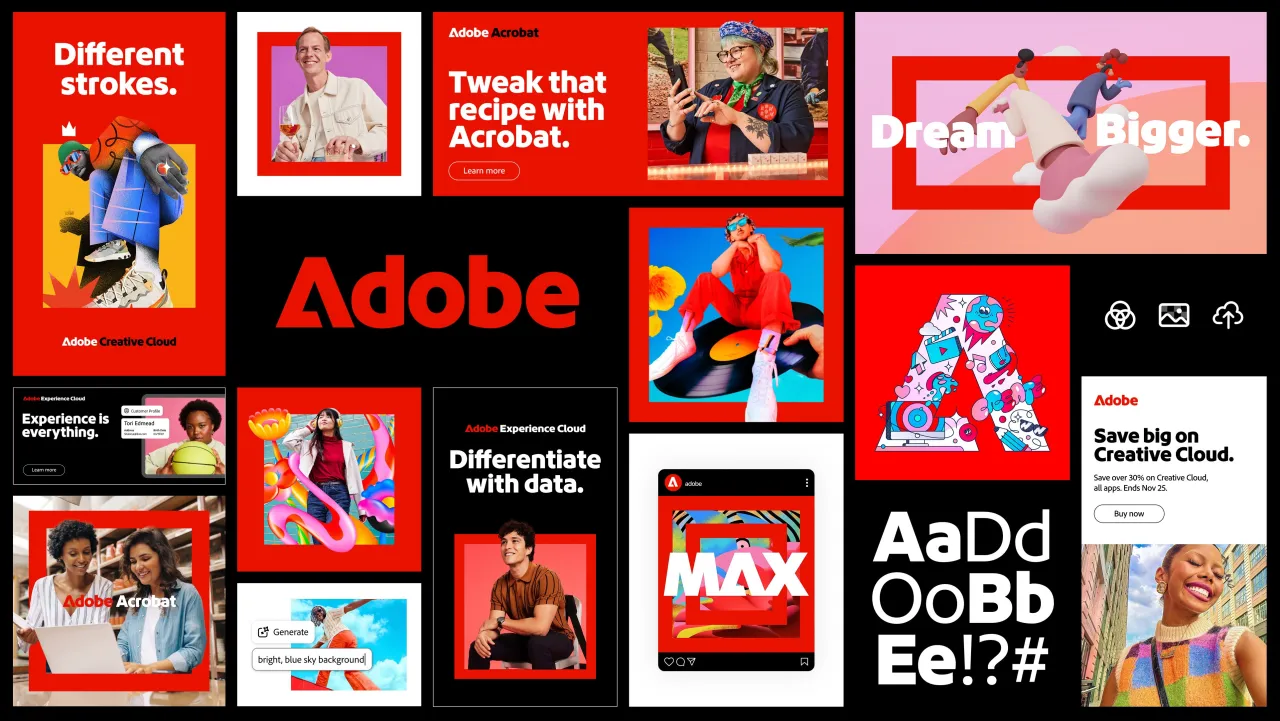
Alex’s first pick is Adobe, and what he likes most is the balance. The system and typography are clean and restrained, which gets the message across clearly. Layer in some playful maximalism and you get a brand that shows off its core idea of unlimited creative possibility.
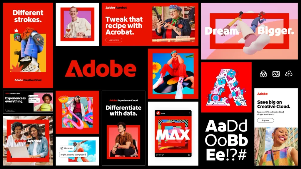
Before the refresh, Adobe felt like a set of separate apps that happened to share a parent company. Photoshop, Illustrator and Premiere each had their own look. Now it all reads as one cohesive brand.
Adobe also made better use of something it already owned: its red. Instead of sitting quietly in the corner on the logo, the colour now acts as a proper anchor across the whole ecosystem.
Alex sees it as a useful contrast to Jaguar’s 2024/25 rebrand, which went for shock value and, in his view, alienated its own audience. Adobe proves you can modernise without gambling the relationship you already have with your customers.
Surreal: A brand with a distinct voice and look
Alex’s second pick is the most playful of the lot. Surreal is a cereal brand happy to be unserious, joking about its own rebrand budget and running billboards full of fake celebrity endorsements.
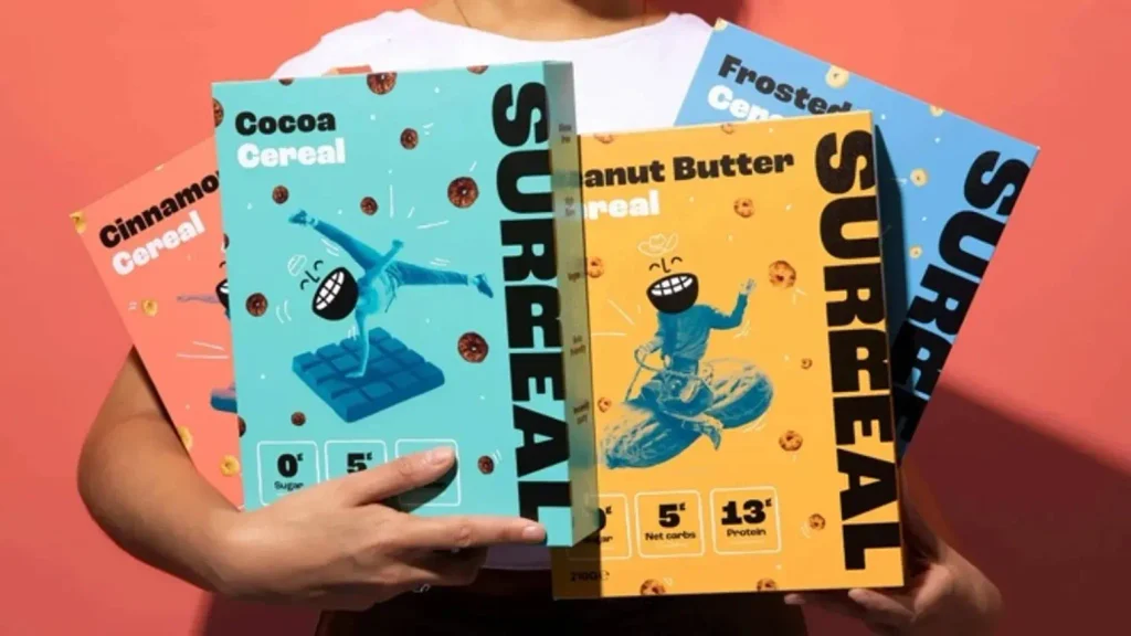
In a category full of wholesome, earnest brands, and up against giants like Kellogg’s and Nestlé, that lightness makes Surreal memorable in a crowded aisle. The fake endorsements barely mention protein or health benefits, unlike almost everyone else in the category. The product nearly disappears and the humour does the selling.
And it works. Surreal reportedly passed £1.5m in revenue in its first year, built a huge organic following on LinkedIn of all places and won listings with major UK retailers. That’s rare for a challenger in such an established category.
What makes it successful rather than just funny is consistency. The brand can joke about its own redesign in the exact same voice it’s always used. That tells you the identity is genuinely embedded, not a gimmick layered on top. “I think a lot of brands could learn a lot from being less serious at times,” says Alex.
What great rebrands have in common
Look across all four and a few clear lessons stand out.
Build on what you already own. Warburtons’ orange and Adobe’s red were already doing the work. The best rebrands amplify existing recognition instead of starting from scratch.
Consistency is everything. Whether it’s 70 bread products, a museum-wide animation tool or a brand voice that never wavers, the strongest identities hold together wherever they appear.
Simple beats complicated. Bold type, clear colour and a single strong idea will always cut through faster than clutter.
Know your audience. Every one of these brands made decisions with real people in mind, whether that’s a shopper scanning a supermarket shelf or a customer who’s used Photoshop for 20 years.
Or as Tayler puts it: bold, clean and most importantly considered design. “I love people that focus on that last 10%. The devil is in the detail!”
One of our proudest achievements was to help West Midlands Safari Park rebrand in 2024 after over 50 years with the same look. We completely rebuilt the brand including a fun and savannah-themed colour palette, iconic Giraffe sub mark and bold typography. But there’s more to this than just a good looking (and award-winning) rebrand. We ran multiple workshops, completed hours of research to understand what mattered most to customers when visiting and turned those insights into a tangible brand that would resonate with the attractions ICP.
Thinking about a rebrand?
At Harrison Carloss we help brands evolve without losing what makes them recognisable. Let’s talk about taking the next step in your brands journey.