Universal Trade Frames
A website framed for success.
Project
Universal Trade Frames
A window into why—
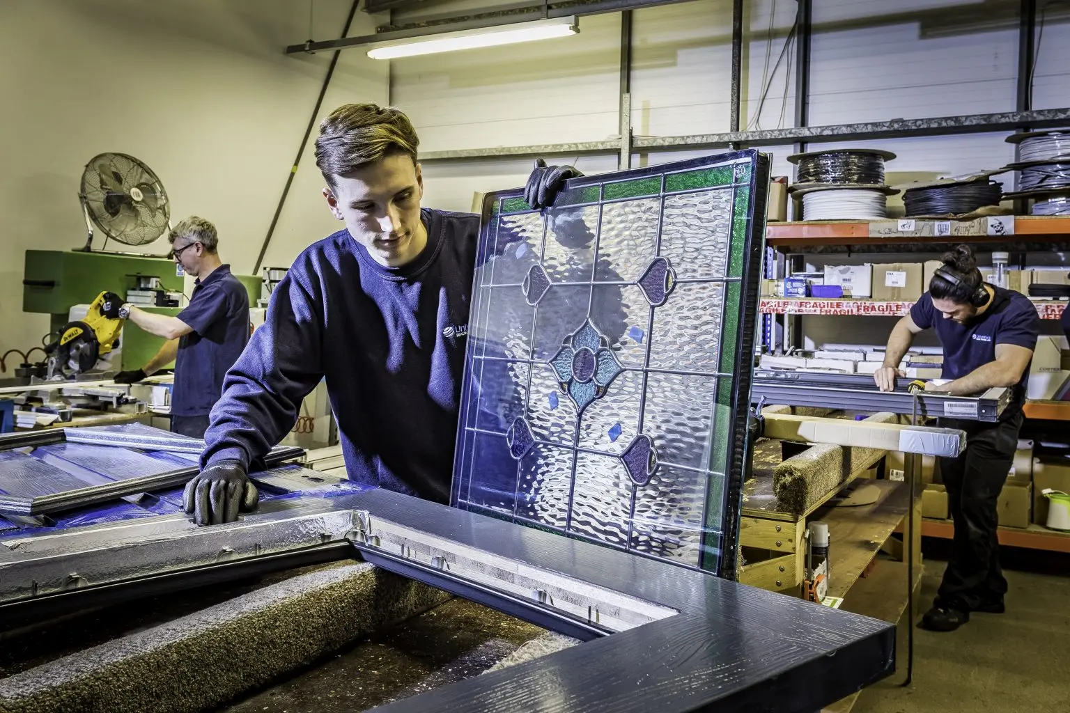
After three decades of operation, the original Universal Trade Frames brand had become a relic of a different era. While the company’s internal technology and manufacturing scale had grown exponentially, the public-facing brand failed to reflect the sophisticated, high-end nature of the business. This disconnect meant that Universal Trade Frames often appeared similar to smaller, less capable fabricators, failing to project its true status as a market leader.
The existing identity was also technically limited; it lacked the flexibility to work effectively across modern digital channels and social media. This was compounded by a website that was not optimised for mobile devices and featured stagnant content. The site failed to represent the current breadth of services and brands, serving more as an outdated digital brochure than a functional business tool. It was clear that to continue growing, Universal Trade Frames needed a “bright and clean” aesthetic that matched its precision-led manufacturing standards.
Repositioning the brand—
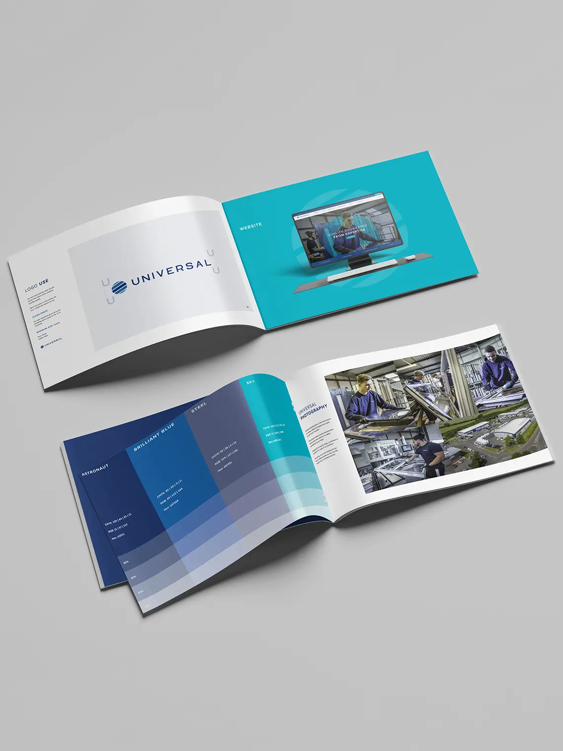
The development of the new brand identity focused on the core values of quality and precision. We wanted to help move Universal Trade Frames towards a brand that feels premium, but also appeals to trade businesses small and large. This involved a complete refresh of the colour palette, where we opted for brighter, cleaner tones, and a typography overhaul that suggests high-end engineering.
This new identity was engineered to be “channel-agnostic,” meaning it maintains its impact and professional integrity whether it appears on a factory uniform, a physical product label, or a high-resolution digital ad. By focusing on a minimalist yet bold design, we ensured that the brand finally portrayed the true scale of Universal, positioning them as a top-tier choice in the fenestration industry for the modern trade partner.

Developing the website—
The website was rebuilt from the ground up to serve as a high-conversion engine for the business. Recognising that the trade industry is increasingly mobile, we prioritised a responsive design that works flawlessly on any device. To solve the issue of data capture, we implemented a dedicated “Downloads and Resource” area. This allows installers to access technical documents while simultaneously feeding valuable lead data into the Universal Trade Frames CRM.
To streamline internal operations, the site was fully integrated with HubSpot, ensuring that every inquiry is pushed directly to the sales team for rapid, efficient communication. Visually, the site now leverages high-quality imagery to let the products speak for themselves, supported by a dedicated “Brand Area” that showcases the company’s extensive range. Finally, we introduced a dynamic news and PR section to host case studies and industry updates, transforming the website from a static page into a living hub for the Universal Trade Frames community.


Fenestration websites.
That open doors.
The work was managed in a very practical and efficient way. Tasks were clearly defined, responsibilities were clear, and progress was steady throughout. The team stayed on top of details, anticipated what was needed next, and kept everything moving without friction, even as the scope developed. Overall, the delivery felt smooth, well organised and easy to manage from our side. They understood the brief quickly, anticipated requirements, and delivered consistently high-quality work with minimal friction.


